A modern, dependable refresh for a specialist software company: logo, colors, website and comms, carried all the way into the product itself.
Euro Informatique builds software for the insurance world: tools for companies that handle repairs after water damage, and the insurance adjusters who assess them.
A brand and website that matched the seriousness and technical credibility of what they do. They already had both, but the look had aged. So the need was a modern, dependable refresh that didn’t throw away the equity they’d built.
A revamp, not a teardown. Keeping what worked and modernizing the rest.
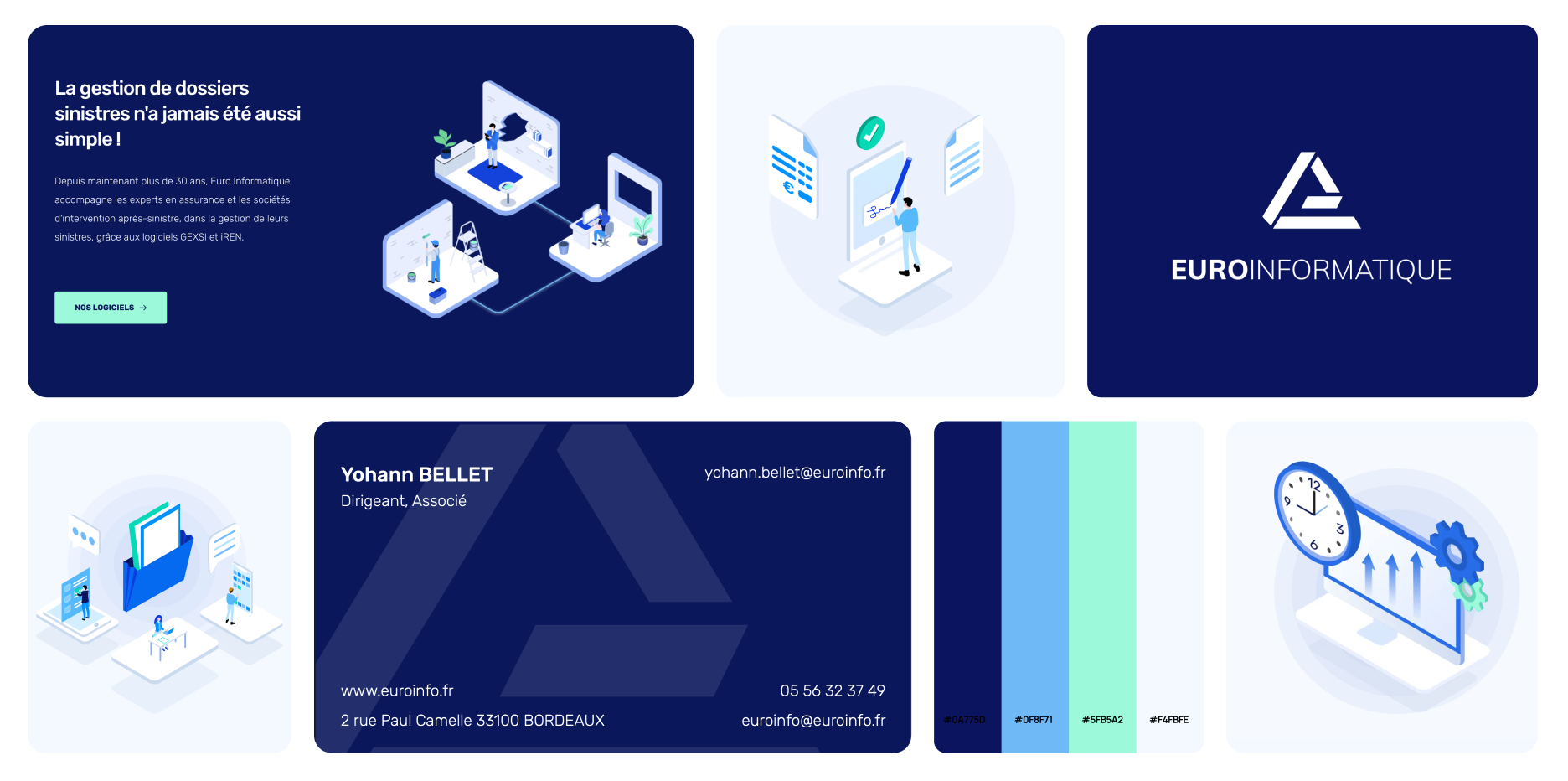
Lead with the logo before → after, then the applications — ending inside the product.
The previous mark — the right idea, dated execution.
Reworked to feel current, still recognizable to people who knew them.
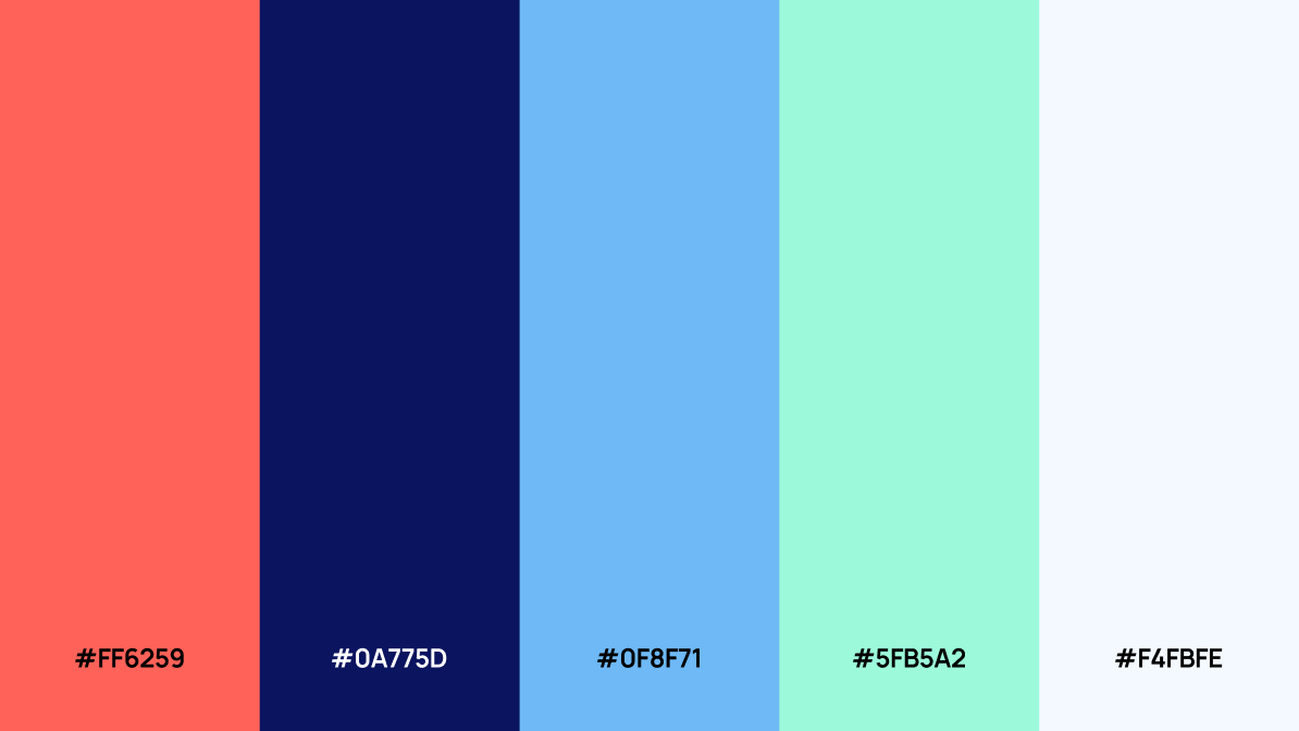
The old palette was too light to read or feel serious. The new darker blue is more technical and dependable — and more usable thanks to the stronger contrast.
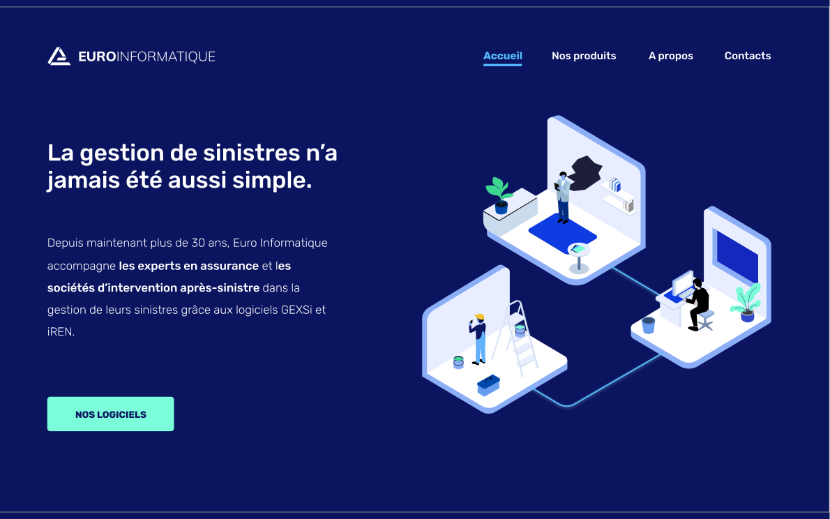
Wireframed to present their products and offer clearly, then built out.
A structure that does justice to a technical, specialist product line.
Made for them, so the site feels owned rather than stock (WordPress / Elementor).
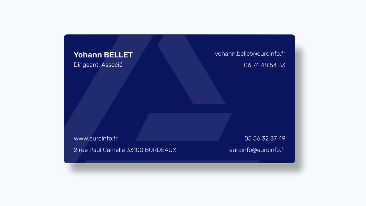
Cards that match the seriousness of the work.
A signature that carries the refreshed look into everyday contact.
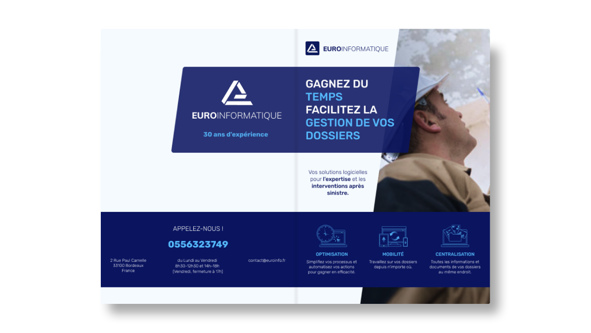
Flyers aligned to the new palette and type.
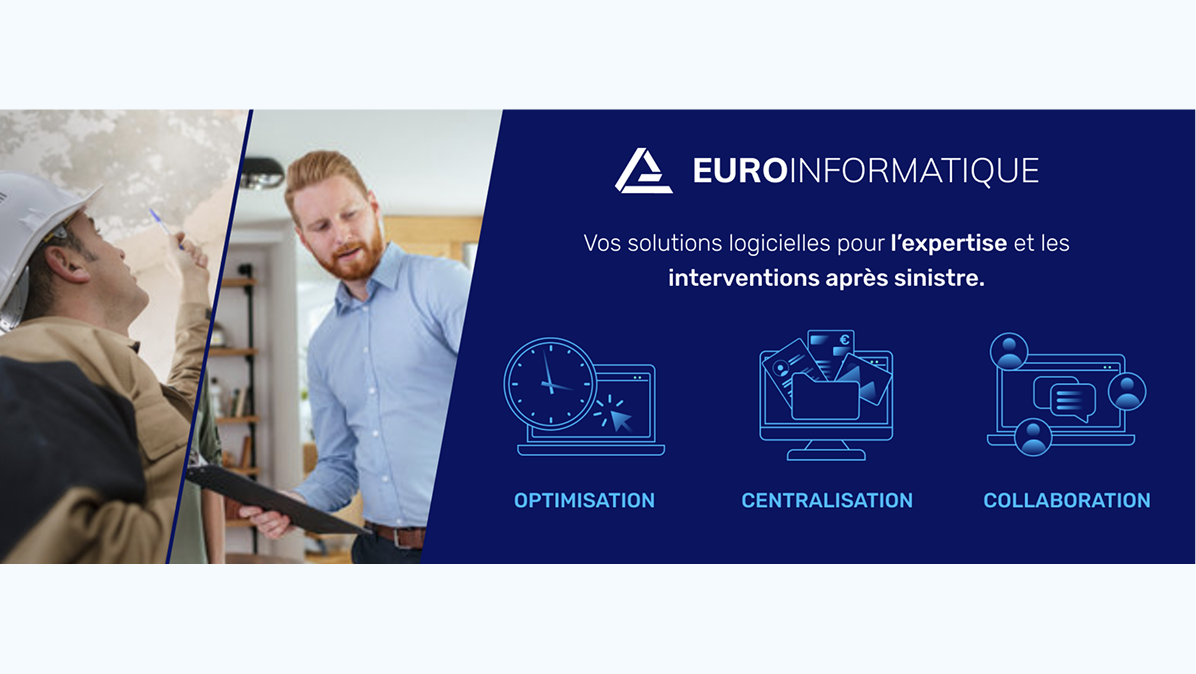
The PDF presentation of their tools, brought in line.
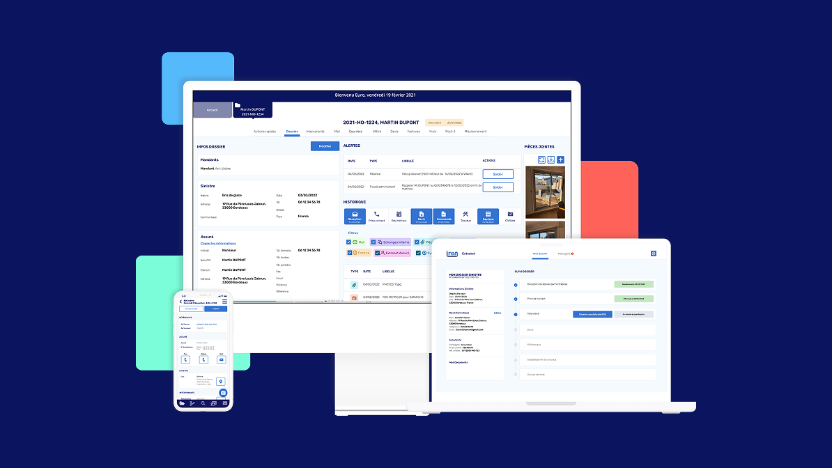
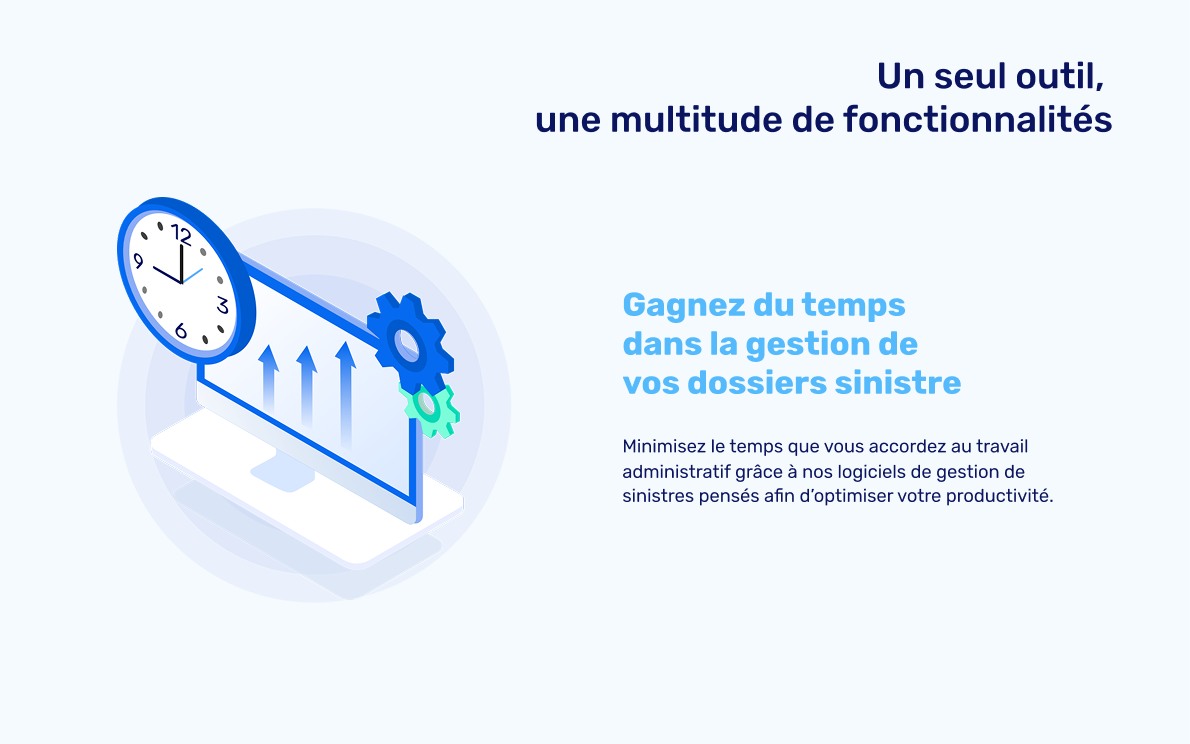
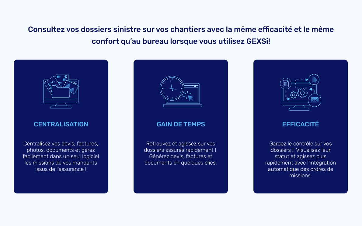
We adapted the identity for their SaaS interface — so the brand is consistent from a business card all the way into the tool people use every day.
A specialist business that finally looks the part — a refreshed identity that holds from a business card to the website to the product interface, without throwing away the recognition they’d already built.