PULP FUNCTIONDESIGN STUDIO Book a call
New brand from scratch

Tom SalleyBrand identity & website

A coach starting out on his own — strong on the work, new to building a presence around it. We gave him a coherent identity that felt like him, and the tools to carry it.

Category Brand Identity
Client Business coach
Mode New brand
Scope Identity · site · comms
Drop the hero — Tom’s identity, site and cards together
Who we served

The Client

Tom Salley, a business coach starting out on his own strong on the work itself, but new to building a presence around it.

What they needed

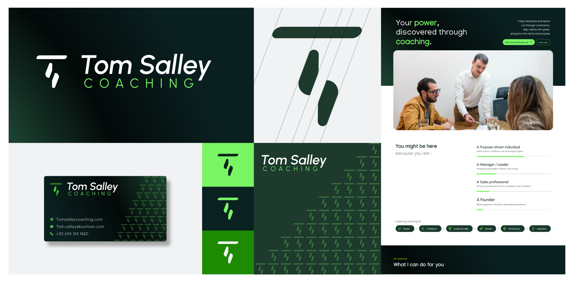
Tom needed a coherent visual identity that felt like him and could reach his potential clients and the communication materials to carry it: website, social media, business cards, and more. He’d already moved fast to get a site up with an AI tool, but it had no real identity behind it, and his materials had grown piecemeal, so nothing felt like him or held together.

What we did

The Method

Started with the foundation, not the visuals.

01 Research

Get the foundation right

+ Started with a survey To understand his business properly: what he offers, what he wants to be known for, who his clients are, and what he’s drawn to visually.
+ Researched his niche His corner of coaching and the visual language his prospective clients already trust, so the identity would feel credible to them, not just to him.
+ Three mood boards Presented as distinct directions; Tom marked what worked on each, which sharpened the direction fast.
02 Design the elements

Build it, piece by piece

+ Wireframed the site Mapping the architecture while the visual direction settled, so structure and look came together rather than one waiting on the other.
+ Designed the logo and identity Once the direction was validated.
+ Built and iterated the website A first version close to final, then several rounds to get it right (WordPress, with a developer).
+ Shaped the copy Helped Tom decide what to say page by page and how to sequence it, so the storytelling made sense for his clients.
What we made

On the Plate

Lay the system out first — logo, palette, type — then the applications.

Logo and visual identity system
AIdentity

Logo and visual identity

The core system tying it all together — logo, palette and type, built to feel like him.

The website — live
BWebsite

The live site

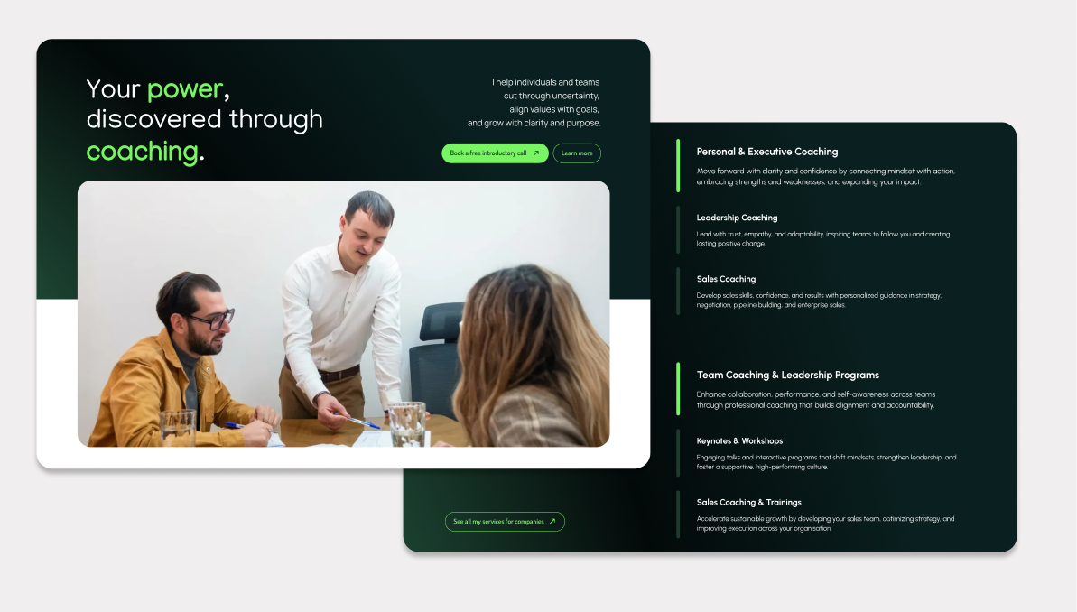
A site with a real identity behind it, built and iterated to final (WordPress).

Business cards
CPrint

Business cards

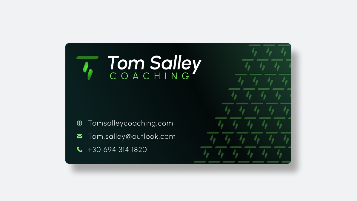
The first thing people hold, finally on brand.

Social templates + LinkedIn banner
DSocial

Social templates & LinkedIn banner

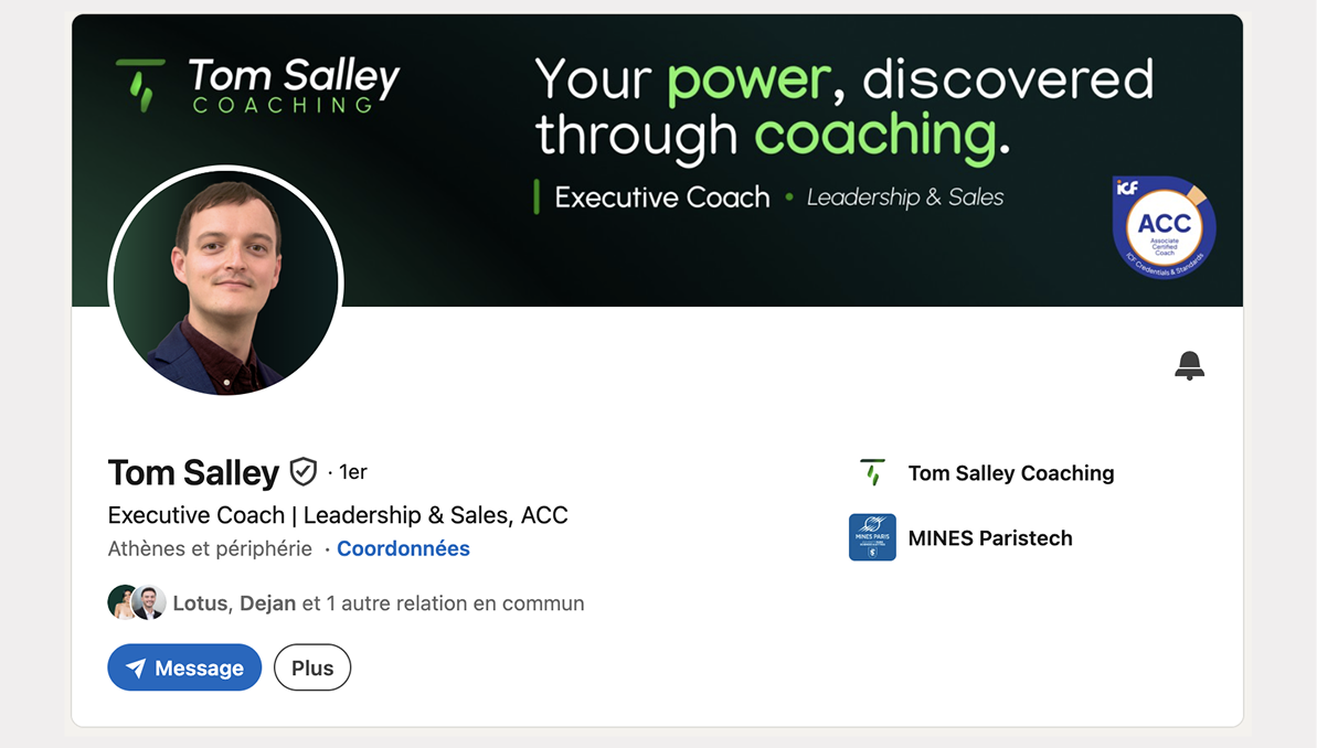
Templates so he stays consistent online without designing from scratch each time.

What it changed

A brand that finally feels like him.

A coherent presence he can stand behind — prospects now land on a site and materials that match the level he actually works at, instead of a piecemeal setup that undersold him.

Now hasA site that matches his level
ConsistentFrom logo to LinkedIn
Feels likeHim
Need the same?

Explore Branding.